

Project Brief
This project challenged me to visually interpret a musical composition by focusing on emotional tone rather than literal representation. Using Furiouser and Spuriouser by Jason Noble as the foundation, the task was to design a 12" x 12" vinyl record sleeve (front and back) that captures the expressive qualities of the piece. The intention was to create a unified visual experience that reflects how the music feels, not necessarily how its subject matter looks.
Concept Rationale
After listening to Furiouser and Spuriouser and studying the score, I was inspired to interpret the themes through the emotions and tonal shifts within the music, rather than by referencing direct imagery from Alice in Wonderland. A class exercise with Michael Zaugg, where we listened and wrote down the words that came to mind, shaped my approach. My list included: abyss, abysmal, lost, confusion, overpowering, targeted, distortion, distraction, and contrast. These words became the foundation for my visual interpretation.
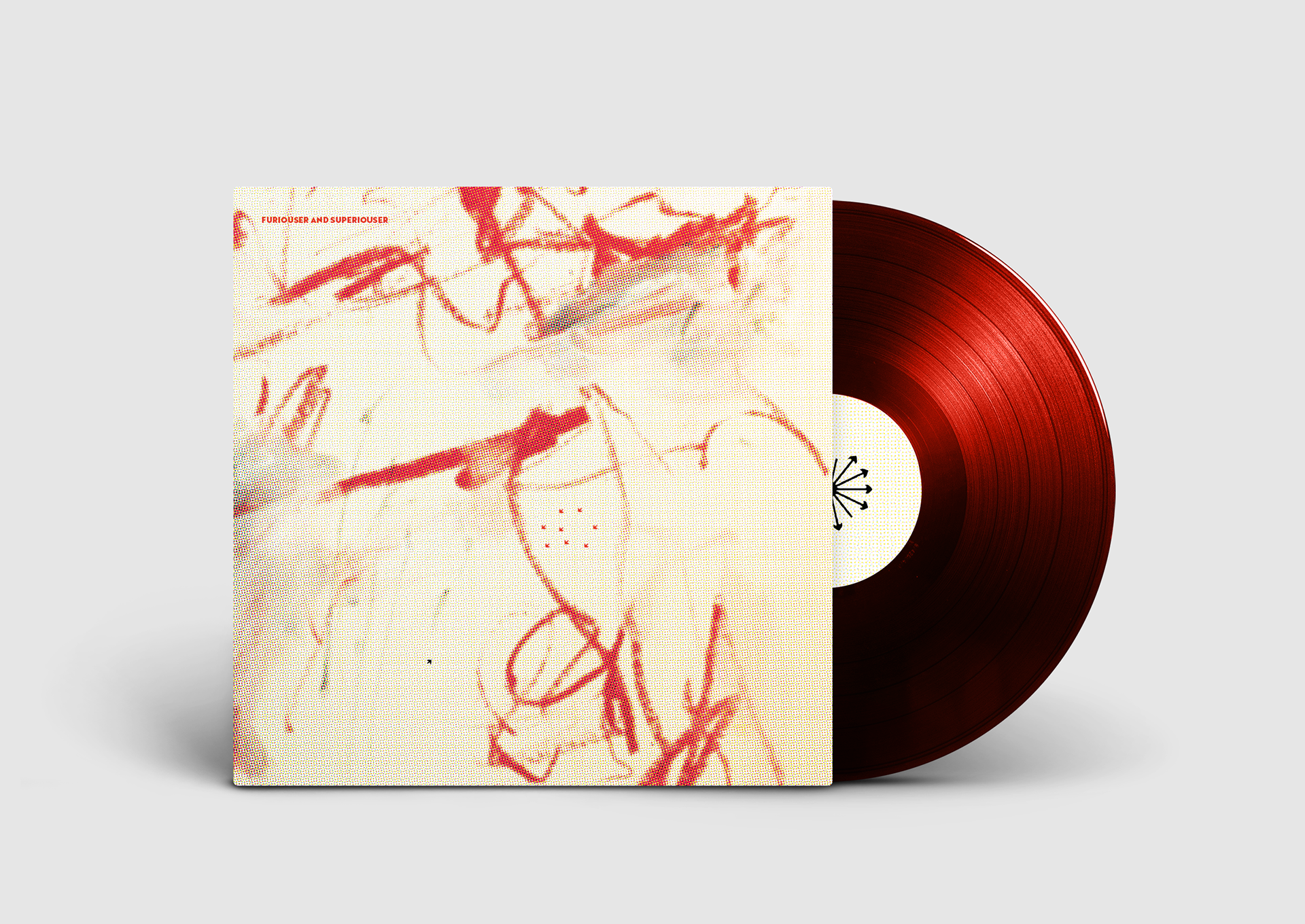
For the front of the album, I explored the concept of a "rabbit hole" not as a literal tunnel, but as a metaphor for the endless, overwhelming abyss of the internet. I used a large amount of white space to represent not only that sense of infinity but also the blank digital screen. It also mirrors the vocal structure of the piece, where the singers' voices rise and fall, loop and repeat, much like the infinite scroll of online content.
This is the space where we become lost, distracted by one thing, then another and bombarded with various thoughts and voices, many of which are nonsensical.
To reflect the layering of analog voices within a digital world, I overlaid a digital film onto a painted surface, communicating the clash between human expression and synthetic online presence. Alysse is represented by a single black arrow on the front cover, surrounded by a herd of red arrows, being a direct nod to the online mob. The idea came from the score itself, where I found the use of arrow symbols interesting and effective in conveying the sense of being targeted.
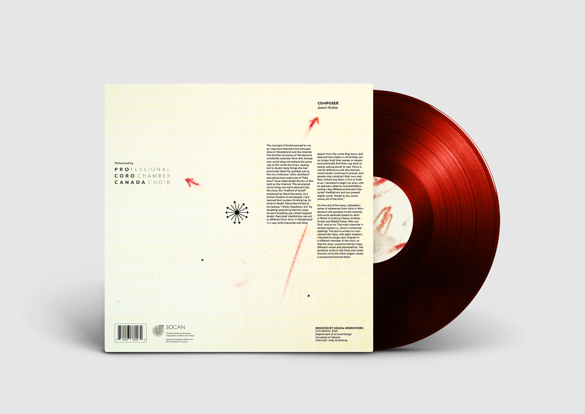
On the back cover, I leaned further into the visual language of the score. I had never seen notation like this before, and its abstract, fragmented quality felt essential to include. The circular symbol in particular caught my attention, used by singers as a sort of randomizer, essential to the piece, and became part of my visual rhythm. I centralized it and drew arrows detaching from it to direct the viewers eyes from each part of information, red arrows guiding to the most important: the singers and composer. The randomness played well into merging the compositions unpredictability into the design.
Client
Jason Noble
Timeframe
March 6, 2025 - March 27, 2025
Role
Album cover design and print production